


| Cancer Gets LOST - 2016 Auction |
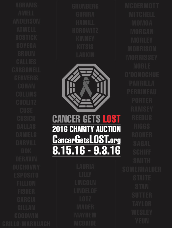 I recently updated the Cancer Gets LOST information flyer with all the details of the 2016 auction. I recently updated the Cancer Gets LOST information flyer with all the details of the 2016 auction.If you are not familiar with Cancer Gets LOST head on over to CancerGetsLOST.org and read all about the fantastic items on offer in this charity auction. Not just from LOST but from many TV shows and films across a broad spectrum of interests. The auction begins on 8.15.16 and yes that is an American way of putting the date, but it makes perfect sense to us LOST fans. |
| LOST 2017 - Official Poster |
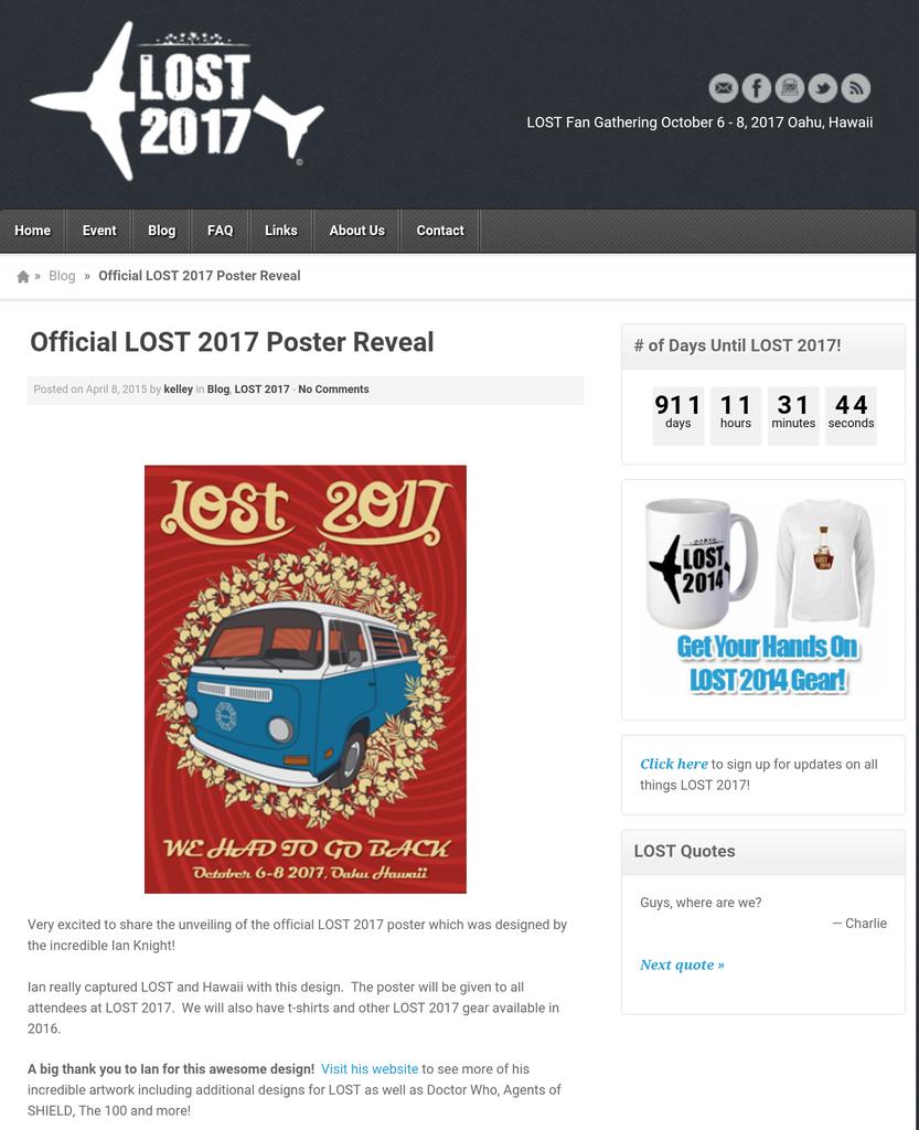 The news is out ! Revealed on Twitter on LOST day (or at least it was for the US fans) - 4/8/15 16:23:42 - by @2017LOST The news is out ! Revealed on Twitter on LOST day (or at least it was for the US fans) - 4/8/15 16:23:42 - by @2017LOSTI had the idea for this while at LOST 2014, after it was announced there would be a 2017 meet up, and after a few (cough) iterations this was the end result. I originally created it just because I wanted to, not knowing that it might be used for the 2017 gathering, but I am so happy that it was deemed worthy. I did think about adding a Hurley or other characters into the van, but decided against it to keep it simple and relaxed, like the 2017 gathering is sure to be. Head on over to the LOST 2017 website to keep up to date with what is happening and meet some like minded LOST fans. |
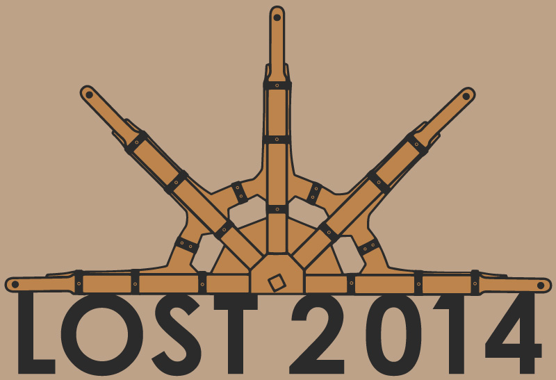
| LOST 2014 in 3D ! |
|
The idea was simple, turn this flat image (left) into a 3D object and get it printed. Problem, first I needed a 3D model to print, and although there are a few models out there of the DHARMA logo that are free to use, I wanted this one to have LOST on one side and 2014 on the other, which none would have. The second issue is finding someone to actually print it. The first problem I tackled by using Adobe Photoshop and teaching myself how to use its 3D capabilities, someone I had met through all the Fringe and Almost Human activity over the last few years works for Adobe and regularly posts articles and information about its 3D capabilities on Twitter (@Nikolai3D), he gave me some great tips and pointers. I wouldn't call myself an expert yet, but I did manage to come up with a model that looked pleasing to me, I worked out that the 3D object although simple in 2D was made up of many parts that needed aligning in the 3D world. 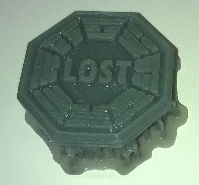 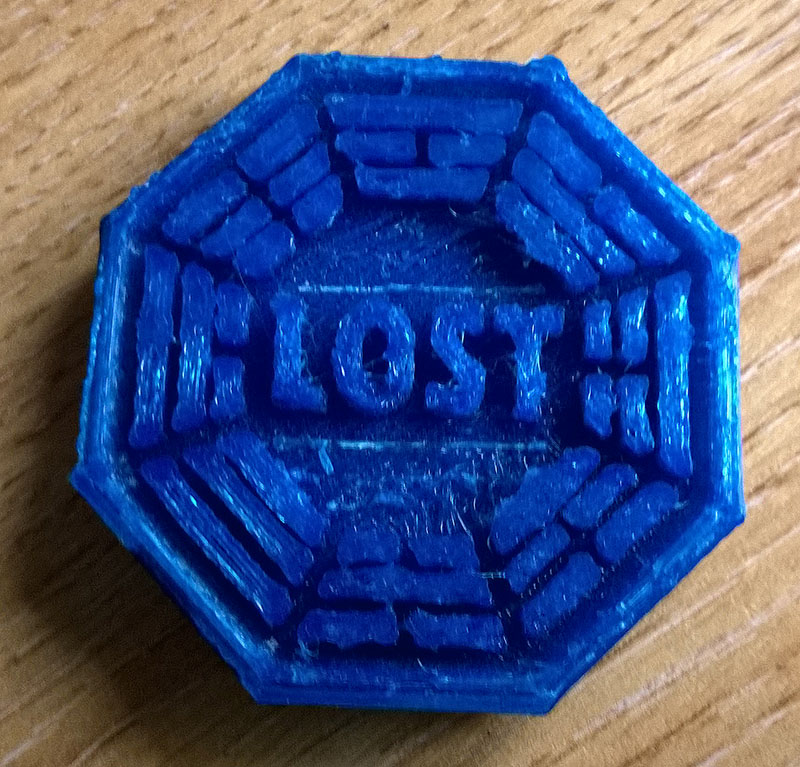 Next was the printing of the object, after searching around I found Hubs. They are a central website resource, where you can upload your model and get quotes from many independent people that have 3D printing equipment around the country. Next was the printing of the object, after searching around I found Hubs. They are a central website resource, where you can upload your model and get quotes from many independent people that have 3D printing equipment around the country.The first people I looked at were based in Sheffield, and as I was going there on business regularly and the printer was just down the road from the office I asked them to print it. They produced two samples one in Resin (Left) and one in ABS Plastic (Right), these are test prints before going ahead with the full order I wanted and the Resin one looked good, but the plastic one looked fairly poor quality. I agreed to ahead with the resin version and waited for my order to be completed, unfortunately I waited a long time and after several email exchanges I was told they would not be able to produce the requested order. 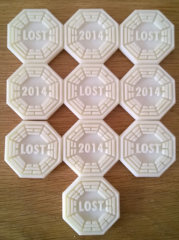 So on to plan B, there was also a 3D hub near to where I live so I contacted them for a quote. Again I asked for a test piece to be printed in plastic and this time the printed piece looked vastly superior to what was produced by the other company, so I went ahead with all 10 pieces. So on to plan B, there was also a 3D hub near to where I live so I contacted them for a quote. Again I asked for a test piece to be printed in plastic and this time the printed piece looked vastly superior to what was produced by the other company, so I went ahead with all 10 pieces.The company is called Mediacopy and this is the link to their own webpage. Their customer service was excellent and I'd thoroughly recommend them to anyone looking for a 3D print like this. As you can see what I got was the 10 pieces I had asked for in white plastic, and they look excellent on their own, but I had decided at the outset that I wanted them to have a metallic gold / bronze like look. In the end I decided to do this to 5 and leave the other 5 as they were. So out came the paint and brushes, below are a couple of photographs from the various stages, click on them (and all the pictures) to get larger versions. 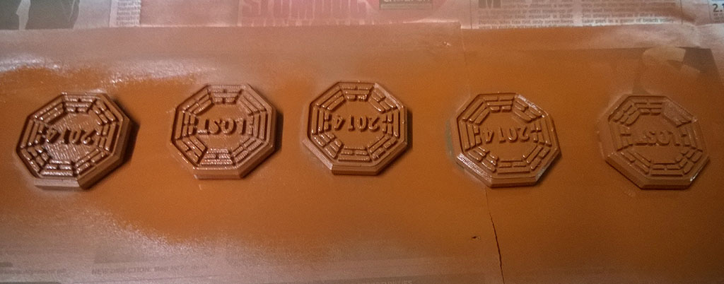 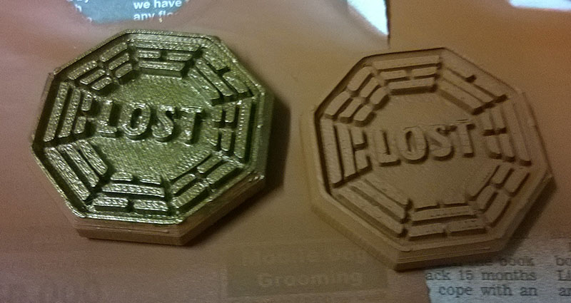 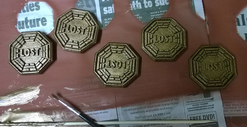 While painting these I found it was actually quite nice to do something outside of the digital world for once ! While painting these I found it was actually quite nice to do something outside of the digital world for once !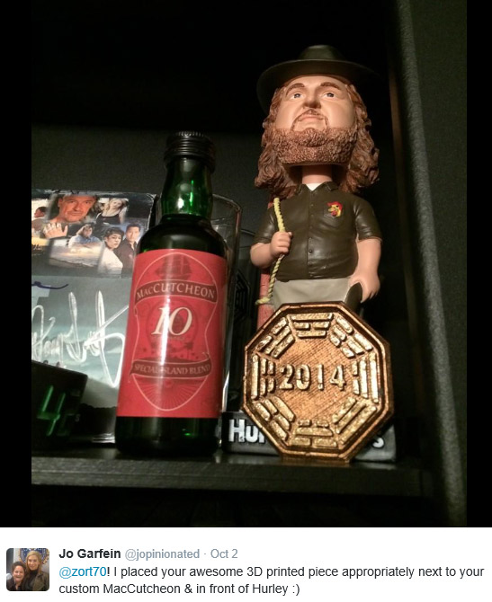 So I finally arrive at LOST 2014 and gave them to Kelly, Jo and Jorge, there were also a few given out as a prize for the Barracks Notice Board competition (more of which later) So I finally arrive at LOST 2014 and gave them to Kelly, Jo and Jorge, there were also a few given out as a prize for the Barracks Notice Board competition (more of which later)It was great fun to do, once I had worked out how to do it, and all I can say is the future is here and it involves 3D printing, I have a couple of great ideas for future projects. I'll give the final word to Jo, who sent me this picture of her token back at home. |
| LOST - Drive Shaft - Not going to Guam Tour 2014 |
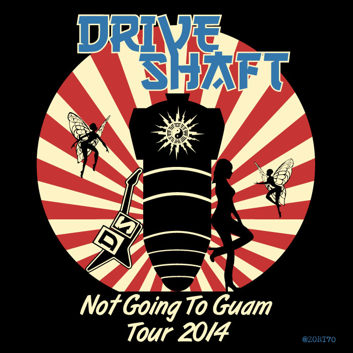 So after LOST 2014 and the emotional highs and lows that the even gave me I thought it was time to share a couple of things that were created for the event. So after LOST 2014 and the emotional highs and lows that the even gave me I thought it was time to share a couple of things that were created for the event.If you were at LOST 2014 in Hawaii recently you may have seen me wandering around in a few of my own t-shirts (I still get a kick out of saying I was there !) One of those t-shirts you wouldn’t have seen before and that’s because I wanted to take something that I knew no one else would have. A lot of you commented and very kindly said how cool it was so I decided to put it onto my Cafepress store for those that want it. 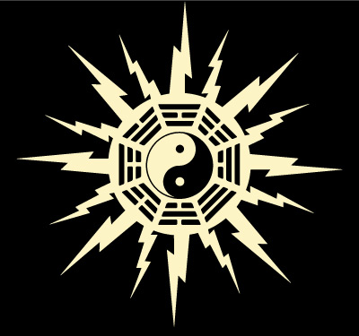 So what is it ? Well it isn’t specifically about any moment in the show I just decided I wanted to create a Drive Shaft tour t-shirt, you could consider it a flash sideways kind of a thing. So what is it ? Well it isn’t specifically about any moment in the show I just decided I wanted to create a Drive Shaft tour t-shirt, you could consider it a flash sideways kind of a thing.I named the tour the “Not going to Guam” tour in honor of Lapidus and it features fairly prominently the Jughead, the Drive Shaft guitar logo, a few other rock and roll staples and no I won’t say who the sillhouette of the woman is based on ;-) The shirt on CP is actually a front and back print, on the back is the little DHARMA / Yin Yang / lightning burst symbol. Link to my CafePress store and just to prove I wore it, here is a picture of me in Hawaii, hiding from a smoke monster in a Banyan tree. 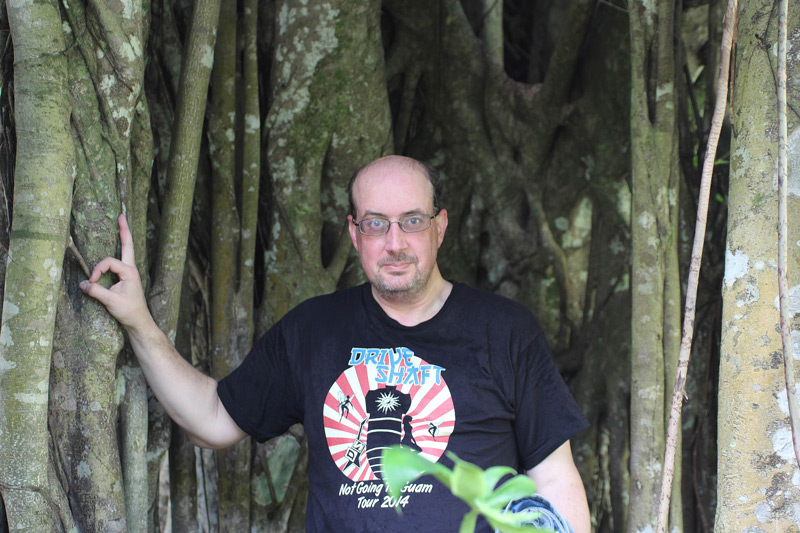 You can see all my LOST 2014 pictures on Flickr - Z70 Photos |
| LOST 2014 - An Epic Journey |
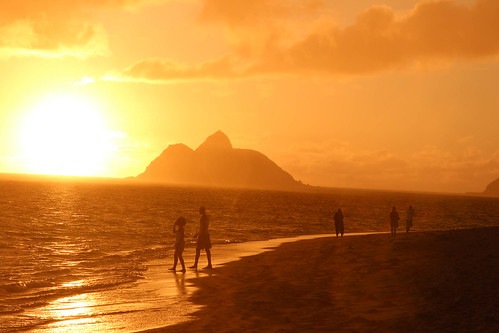 Back from LOST 2014 now and have reflected a lot on what happened, it was a few weeks of utter highs and one very sad low. Back from LOST 2014 now and have reflected a lot on what happened, it was a few weeks of utter highs and one very sad low.To touch on the low for a moment, it was heart wrenching to learn of Bonnie Craft's passing moments before boarding our plane back to the UK, we had seen bonnie a couple of times briefly during the stay in Hawaii and I can't imagine what life is going to be like without her for her family and friends. She was so supportive of me personally and all I can say is I will miss her so much. During the stay in Hawaii we saw some of the most beautiful sights and places I have ever seen and with the link to LOST it was pretty much a perfect place to be. The picture above is a sunrise on the morning after LOST 2014 finished, it was well worth getting up very early to drive over to the East side of the island to witness it. All the photographs from the trip can be found on my Flickr site Z70 photos 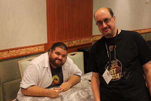 At the event we got to meet Jorge Garcia of course and he is a genuinely lovely person to talk to, he signed my poster and another artwork which I will mention in a later update on this site. At the event we got to meet Jorge Garcia of course and he is a genuinely lovely person to talk to, he signed my poster and another artwork which I will mention in a later update on this site.Talking of the poster, do you remember back in September 2013 I was a joint winner in the LOST 2014 competition to design a logo. Kelly, the fantastic organiser of the event, decided to print my design as a small poster and include it in the gift bag for every attendee of LOST 2014. I can safely say that this is the biggest run of any poster design I have ever created ! 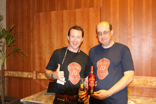 One of the other designs I created for the competition a year ago was this one based on the McCutcheon whiskey bottle label and on the night of the Cancer Gets LOST charity auction both Paul and I wore our t-shirt version and held the replica bottle that was in the auction. One of the other designs I created for the competition a year ago was this one based on the McCutcheon whiskey bottle label and on the night of the Cancer Gets LOST charity auction both Paul and I wore our t-shirt version and held the replica bottle that was in the auction.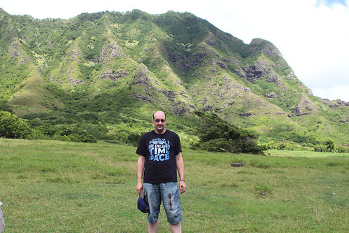 You can see al the photographs by using the link above, but one final thing to bring things full circle, this is me on Hurley's Golf course which we visited on one of the island tours and this was actually my prize for winning the competition a year ago ! You can see al the photographs by using the link above, but one final thing to bring things full circle, this is me on Hurley's Golf course which we visited on one of the island tours and this was actually my prize for winning the competition a year ago !
|
| LOST Quotes T-Shirt |
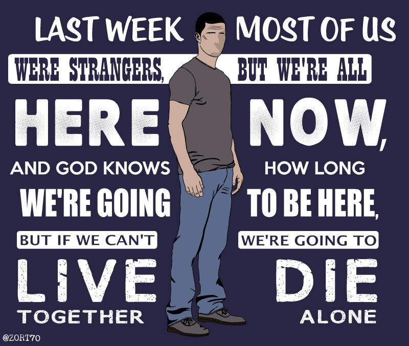 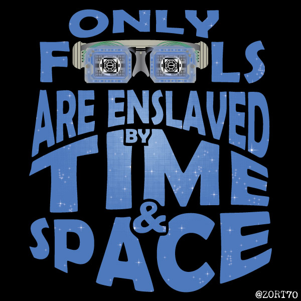 With the upcoming trip to LOST 2014 on the horizon I have created a couple of t-shirt designs featuring my favourite show. With the upcoming trip to LOST 2014 on the horizon I have created a couple of t-shirt designs featuring my favourite show.The first features the famous Jack Live Together Die Alone speech. 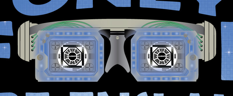 The second is a little more obscure, but a big part of LOST mythology, the glasses that are part of the design give the clue, as it is from the Room 23 scene. The second is a little more obscure, but a big part of LOST mythology, the glasses that are part of the design give the clue, as it is from the Room 23 scene.In that scene, in amongst the noise and flashing images there is a voice played backwards that says "Only fools are enslaved by time and space" I have put these designs in various places for purchase or voting, so here are the details of where to look - Visit my LOST Cafepress Store or Vote for Live Together Die Alone on the daily t-shirt site Qwertee |
| LOST MacCutcheon 10 Year Anniversary |
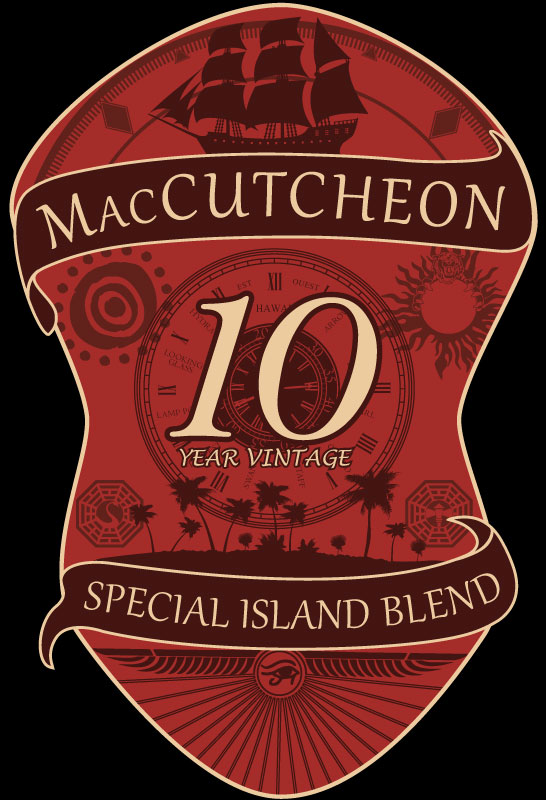 It is LOST's 10 year anniversary, and there are lots of things being lined up for this year. It is LOST's 10 year anniversary, and there are lots of things being lined up for this year.Including of course LOST 2014 which I designed the bottle logo for that is available via the LOST2014 website. As part of the competition for the logo I also designed an anniversary MacCutcheon whisky label, this wasn't chosen, but that give me an opportunity to update it and transform it. This I have done and the result is shown here. As this was already intended for a t-shirt design I have uploaded it to Qwertee and a few other t-shirt websites. I'd really appreciate it if you could vote for it so it could be available in time for the anniversary If you really can't wait for then the image is available on my CafePress store in the LOST section (of course !) I asked a couple of friends to use the CP store to order a couple of the items and you can see the results below, first are four t-shirts, mine are the two on the right, the ones on the left contain the other winning LOST 2014 logo. The image on the right is of a large drinking glass with the design. 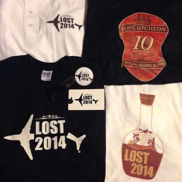 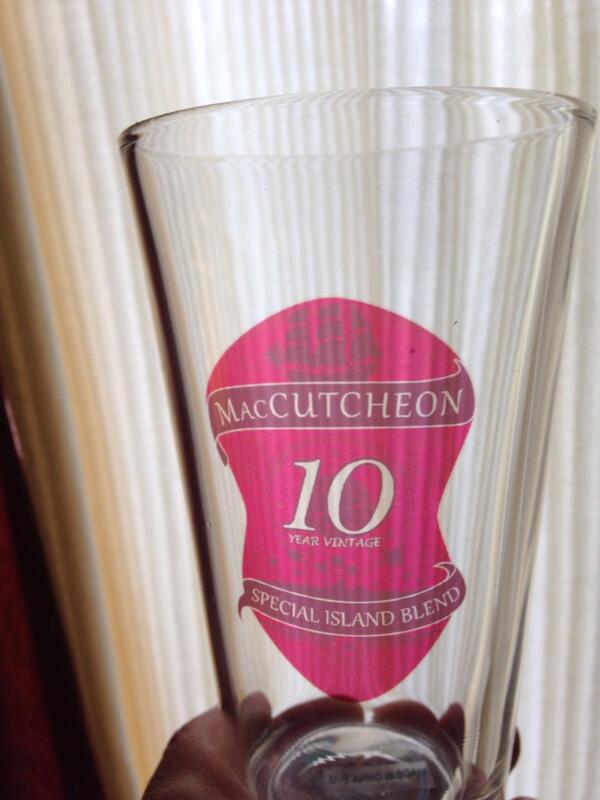 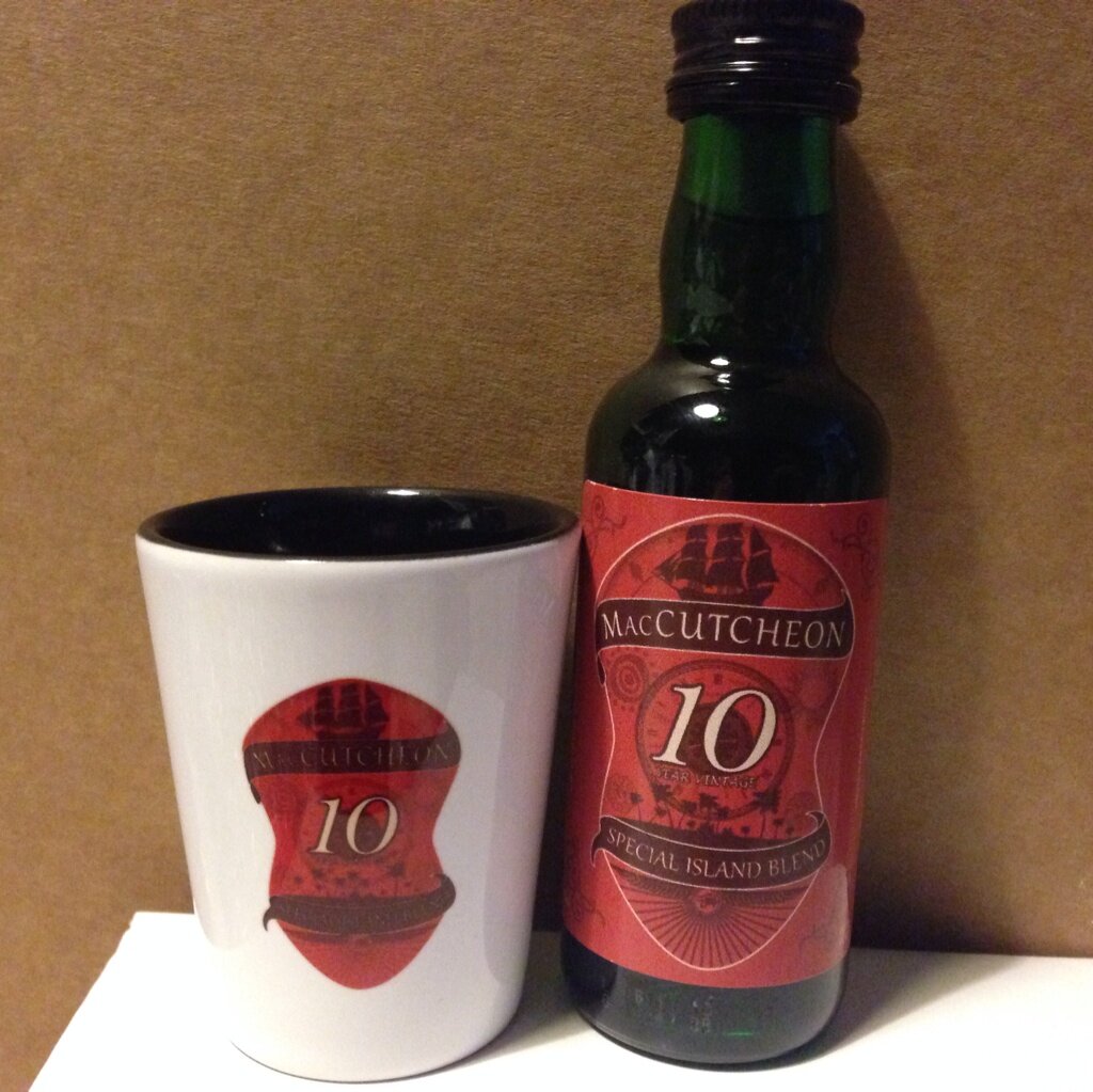 The #seeeekrits are out ! you might have seen if you follow me on Twitter that just before the LOST Paleyfest panel a fan dinner was held during which miniature whisky bottles and shot glasses with the label were handed out to the guests. The #seeeekrits are out ! you might have seen if you follow me on Twitter that just before the LOST Paleyfest panel a fan dinner was held during which miniature whisky bottles and shot glasses with the label were handed out to the guests.A bifg thanks to Paul (@TK10815) for suggesting, organising and arranging everything ! |
| Winner ! |
 Following on from the LOST 2014 competition I am delighted to say I won ! Following on from the LOST 2014 competition I am delighted to say I won !In actual fact there are two winners as the bottle design is not 100% right for a simple one colour printed logo which I have to agree with. Exactly how my design is going to be used is unknown to me at the moment but I'm sure the people behind LOST 2014 are working overtime and will let us all know soon. Until then a special thanks to everyone that shared the details of the competition and voted for me ! |
| Island Protectors - 5-0 LOST Mashup |
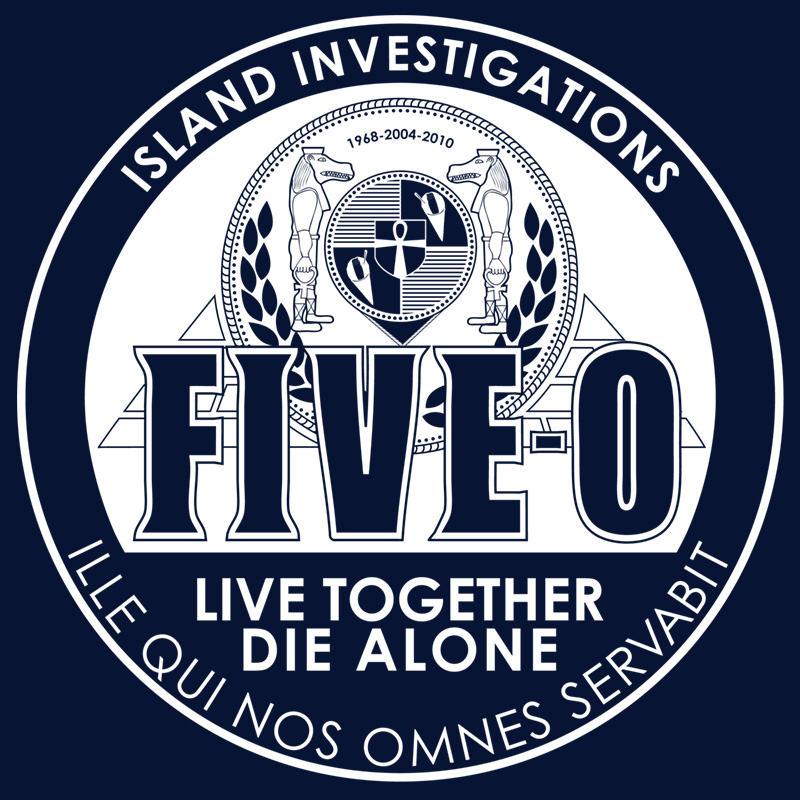 So after starting to design this over 2 years ago I've made some little tweaks and finally made it available as a t-shirt on Cafépress and Redbubble ! So after starting to design this over 2 years ago I've made some little tweaks and finally made it available as a t-shirt on Cafépress and Redbubble !Link to Cafepress Link to Redbubble |
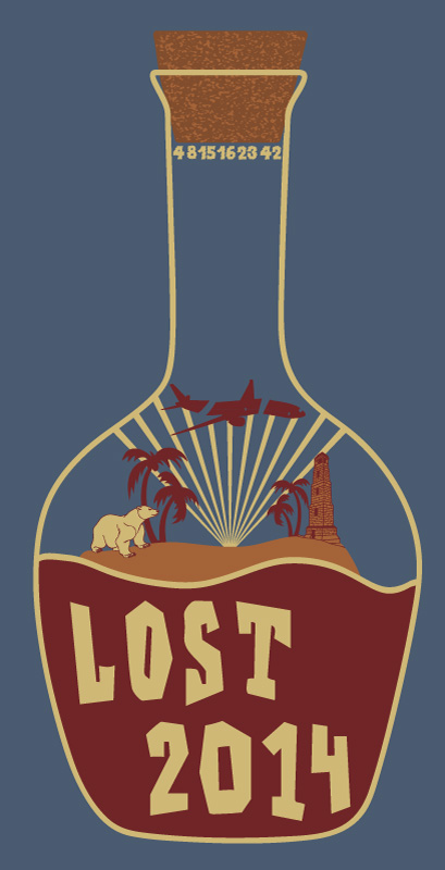
| LOST 2014 Logo Competition |
|
Below are my competition entries for the LOST 2014 logo competition, click on each one for larger versions and underneath each one is a vote link. More Information I had already created one of these images before the competition was announced in anticipation of this moment :-) 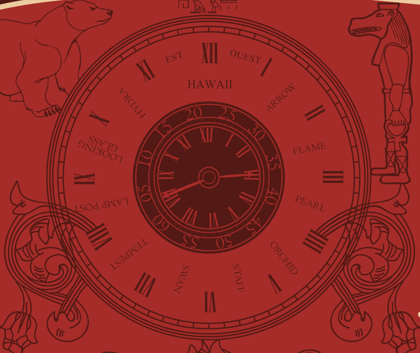 The first one I created was the McCutcheon bottle label design, however the first version had the Ajira and Oceanic airlines logos in the background of the label but as the rules of the competition don't allow them I had to swap them for a polar bear and the Taweret statue. The first one I created was the McCutcheon bottle label design, however the first version had the Ajira and Oceanic airlines logos in the background of the label but as the rules of the competition don't allow them I had to swap them for a polar bear and the Taweret statue.In the center of the label is a watch face and I have altered it from the original to include some familiar names. The second design I created was in response to the competition asking for a "logo" so I decided to strip everything back and just make it as simple as possible, the frozen donkey wheel features in a little more detail with a simple font based statement of the event name. 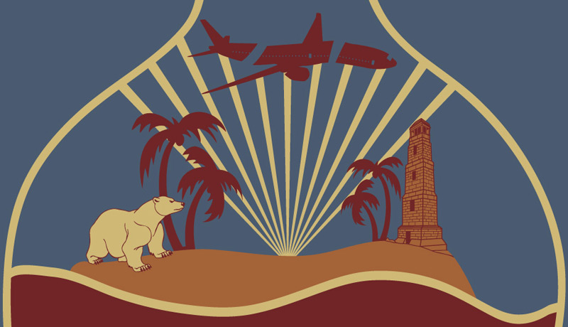 The third design evolved from an idea I had a while ago but never worked on until now. The third design evolved from an idea I had a while ago but never worked on until now.It is of course Jacob's bottle he used to describe the nature of the island to Richard (Ricardo) when he arrived. I decided to include a little diorama of the island and tried a few elements to represent the show. In the end I chose a polar bear, palm trees and the lighthouse, plus light shining out from the swan station hatch and hitting Oceanic 815. (by the way items are not to scale !) 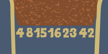 There is also a little whisp of smoke up near the cork trying to escape in the form of the numbers. There is also a little whisp of smoke up near the cork trying to escape in the form of the numbers.The fourth design was a slightly later entry, I had an idea about creating a compass based design like Locke's that Richard shows him when he is young. However looking at images of the compass prop, it isn't that remarkable and looks pretty much like any other compass. So I thought I'd come up with something slightly more original. Although the end result isn't entirely compass like it was the sentiment behind the design. I also made a decision to go for a 1 colour design (1 colour plus a background), around the outside are of course DHARMA station logos. I have had one comment to say it looks like a poker chip design, which I have to agree with, and I'd love to see if this would work at that size. Thanks for reading this rather long post and you can read all about the LOST 2014 Fan reunion by going to the website http://lost2014.com/ |


| LOST The Text Based Adventure |
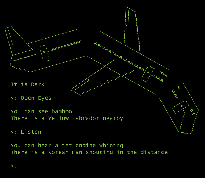 Imagine a time before computer graphics and all you had was a green screen terminal. It may sound like madness, but unfortunately I can remember such a time. Now if LOST was a TV show back then, there may have been a computer game based on it and following in the footsteps of some the gaming industries pioneers I thought why not try and imagine what that might look like. This design is available to purchase in t-shirt form on Cafe Press and Red Bubble |
| Apollo Bar and Grill T-shirt |
 If you missed it when it was on TeeBusters then this is your chance to get the Apollo Bar and Grill t-shirt now available on RedBubble and CafePress CafePress.com RedBubble.Com |
| Cancer Gets LOST - Tough Interview |
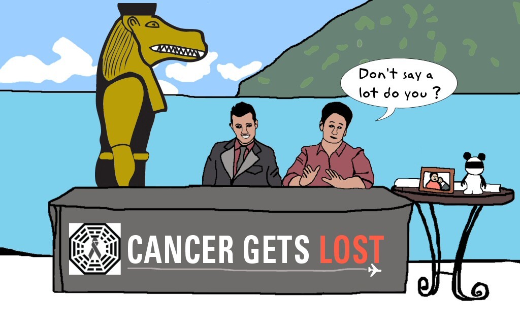 During the Cancer Gets LOST live webcast I decided to try and create a sketch of the scene It turned into this small cartoon where Jo and Jared try to interview the four toed statue. |
| Cancer Gets LOST - TeeBusters T-Shirt |
|
This one will help make a difference. TeeBusters have kindly agreed to the sale of this design and 100% of my sales commission will be donated to the charity supported by the Cancer Gets LOST event. Please share with all your Lostie friends and when it is for sale on the 17th (Midday UK) tweet, share on Facebook, forums and generally make a nuisance of yourself until everyone knows about it. 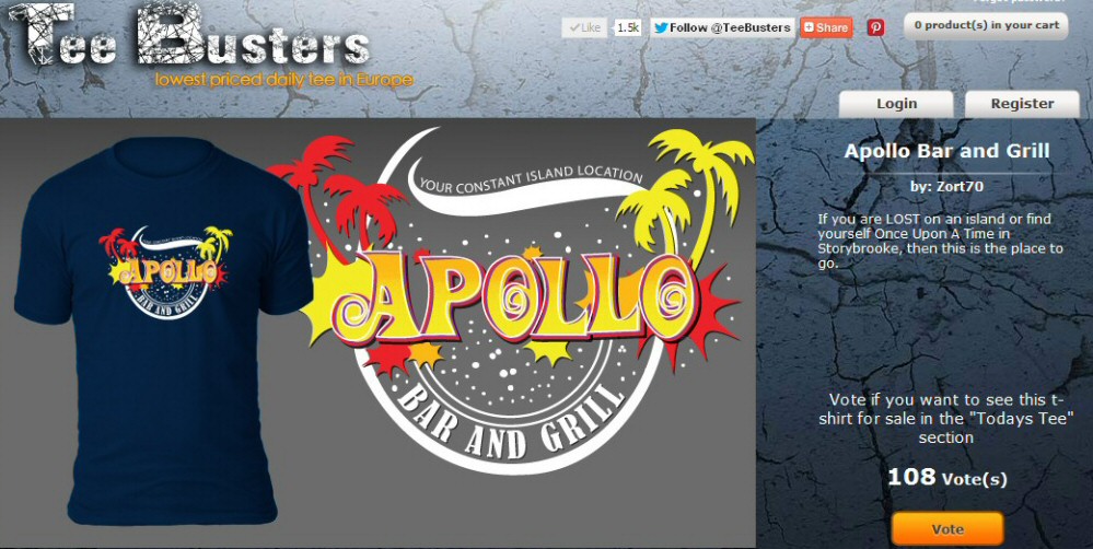 Cancer Gets LOST is a charity event and auction that aims to raise money for the US National Brain Tumor Society Cancer Gets LOST is a charity event and auction that aims to raise money for the US National Brain Tumor SocietyFind out more and look at all the fantastic LOST related items for sale, most of which are signed by cast and crew, on the Cancer Gets LOST website - CancerGetsLOST.org For additional support you could use the image in the top left of this post as your profile icon to let other people know about this. |
| Apollo Bar and Grill |
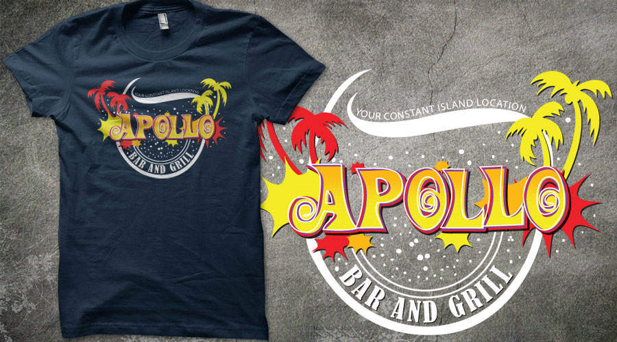 A new LOST inspired t-shirt design, featuring the Apollo logo. However there is also a link to Once Upon A Time as it is also featured in Storybrooke. You can vote for this design to be produced on Qwertee |
| The Island to Alcatraz Island |
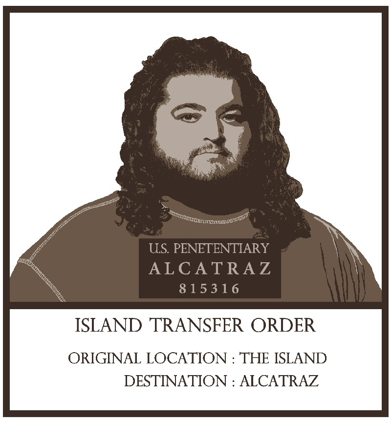 Yes it's nearly time for the new US TV Show Alcatraz to air in the states, so I thought I'd create something to aid the transition from island to island. Yes it's nearly time for the new US TV Show Alcatraz to air in the states, so I thought I'd create something to aid the transition from island to island.
|
| LOST 1 Year Anniversary Frozen Donkey Wheel |
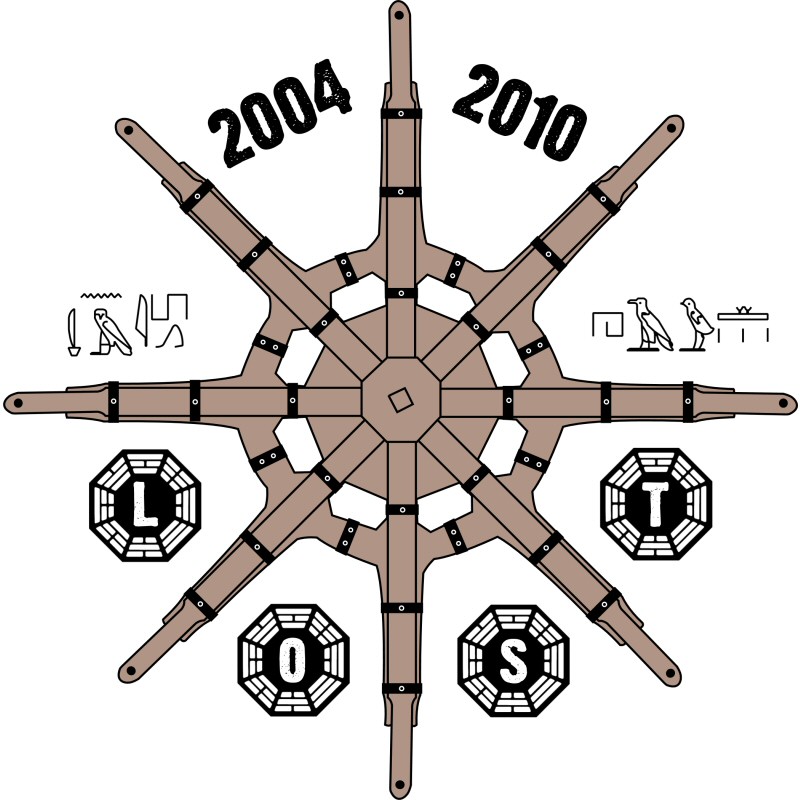 Yes tomorrow is the 1st Anniversary of the end of LOST. Like many LOST fans I've been spending the last year thinking about the show and seeing LOST related items in all sorts of wierd and wonderful places. Yes tomorrow is the 1st Anniversary of the end of LOST. Like many LOST fans I've been spending the last year thinking about the show and seeing LOST related items in all sorts of wierd and wonderful places.As it was coming up to the anniversary I decided to create something that celebrated the show, but would also show off something that was a big part of it.  After much research (yes I watched a lot of LOST again) I decided on the Frozen "Donkey" Wheel that took Ben and Locke to Tunisia in different time periods. After much research (yes I watched a lot of LOST again) I decided on the Frozen "Donkey" Wheel that took Ben and Locke to Tunisia in different time periods.Anyway I hope you enjoy the image and if you like it I have created some items on my Cafe press store including, t-shirts, iPad cases and a clock. |
| Stained Numbers |
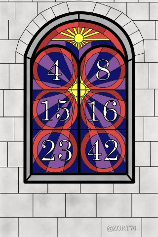 This design was created to emulate the stained glass window seen in the last episode of LOST. In the show the actual window has symbols of faith in the middle of the circles This design was created to emulate the stained glass window seen in the last episode of LOST. In the show the actual window has symbols of faith in the middle of the circlesI didn't want to just recreate that image so I substituted the symbols for the LOST numbers. Some people almost worship them as well, after all millions of lottery players can't be wrong :-) So I created the stained glass window design (minus the brickwork) and create a few Cafepress items with it on. I also put it forward to the limited edition t-shirt site Qwertee (You can vote here). Then I thought that I might produce something different from this design so I added some brickwork around the window. I created a version for my phone, and realised other people might like this too so here it is. Click the image above or click here for a few different sizes that should fit a lot of popular makes of phone. |
QUICK LINKS
TELEVISION FILM T-SHIRTS POSTERS LOST DOCTOR WHO STAR WARS FRINGE AGENTS OF S.H.I.E.L.D. SHERLOCK ALMOST HUMAN REVOLUTION SLEEPY HOLLOW DOMINION
TELEVISION FILM T-SHIRTS POSTERS LOST DOCTOR WHO STAR WARS FRINGE AGENTS OF S.H.I.E.L.D. SHERLOCK ALMOST HUMAN REVOLUTION SLEEPY HOLLOW DOMINION
Gallery Why Zort ?
- Older Articles
