| Almost Human |
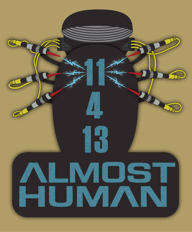 You may not be aware but starting soon in the US is a new TV show called Almost Human. You may not be aware but starting soon in the US is a new TV show called Almost Human.It is being produced by J.J.Abrams (Bad Robot) and J.H.Wyman, who also was the show runner for Fringe. Set 35 years in the future, when police officers are partnered with highly evolved human-like androids, a human cop is partnered with a discontinued android with unexpected emotional responses. A whole host of Hollywood actors and action aplenty this should be a fantastic TV show to watch. So now to explain what this, and the icons below are, as you might recall I created quite a few icons for Fringe during it's final two seasons to help promote the show. There are a few like minded souls from the Fringe days that appreciate what Joel Wyman and Bad Robot did for Fringe and we want to support this new show as much as possible. So we have started creating things and promoting on social media where we can to help spread the word. The image above is a small promotional banner to state the date (in US format for those Brits who are reading this). It is based on a machine seen in the promo videos which appears to help switch on the android police officer. Below are four icons, one is an icon version of above, one is based on the police dept logo seen in the promos. One is a little sneaky as it is a logo for an electricity company seen in a behind the scenes photo shoot, and the final one is one I created before even seeing a trailer which as a mechanical hand reaching out to a human hand, which I am assured has some significance in the show. 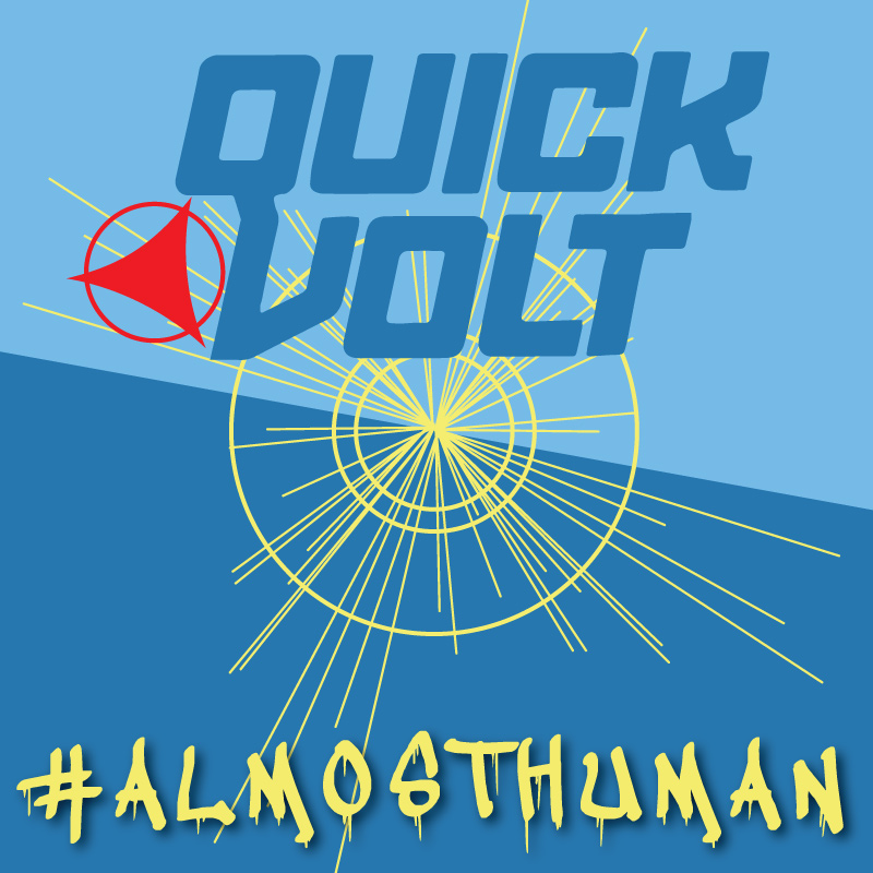 You can see these and many more icons that are free to use on Twitter and elsewhere on the Almost Human Icon Matrix which is being tested right now - Click here to see the Almost human icon matrix |
| Tahiti Its a Magical Place |
 If you have been watching Agents of SHIELD then you will know what this is all about. I've uploaded this T-shirt design to Qwertee so if you have a moment to vote please do. |
| Nerdfest Here I Come ! |
 The last packages arrived today for Nerdfest Comic Con in Nottingham this Saturday. The last packages arrived today for Nerdfest Comic Con in Nottingham this Saturday.Yes THIS SATURDAY ! I signed up for this back in April and have no idea where the time went. Oddly enough at the same time it feels like it has been an age in coming with all the things I wanted to create for this only coming together in the last few weeks. So what did the parcels contain I here you ask, well the answer is two things and 14 things at the same time. 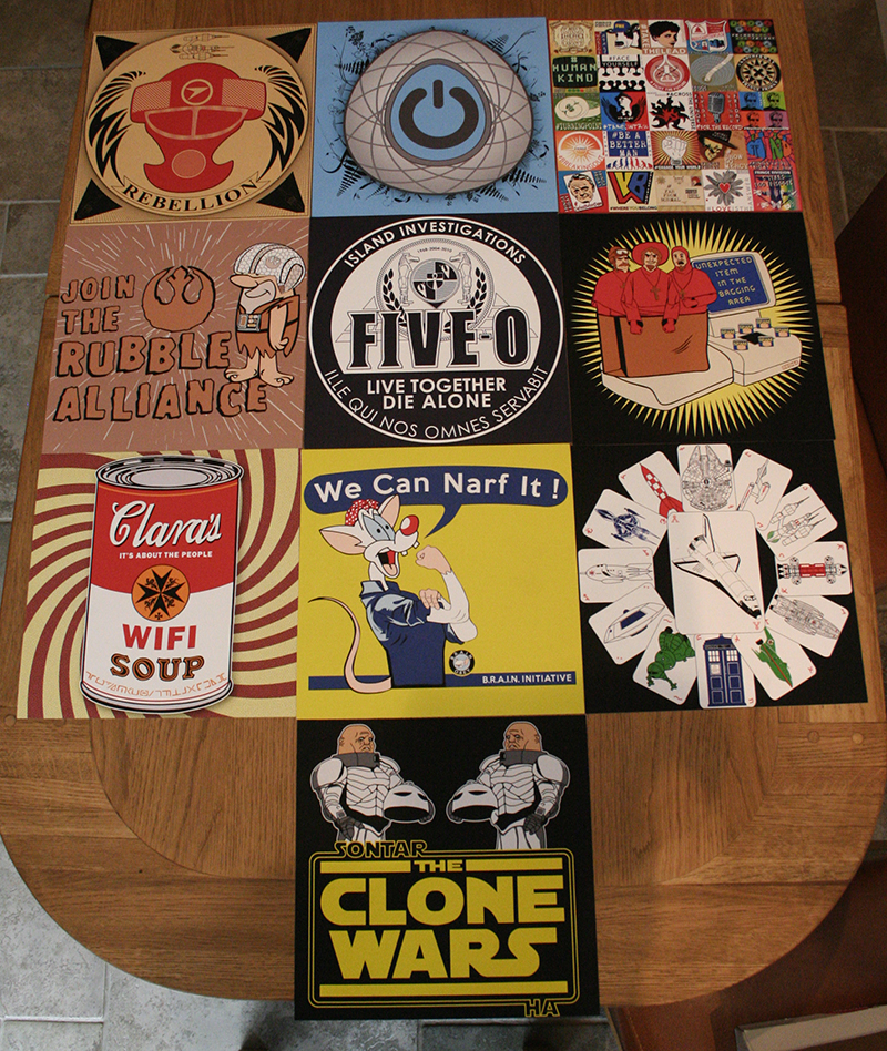 The Iconic Series The Iconic SeriesA limited edition high quality digital print run. I'm not saying these are iconic images, but icons in the computing / social media sense. I wanted to mirror some of the icons I have used on my own social media profiles in print. Each one is a 25cm (10 inch) square digitally printed on heavy weight matte card stock. As you can see there are 10 images in the first series and each design will be limited to 45 pieces available for sale. In case you are not familiar with the subjects, from the top left - Blakes 7 - Revolution - Fringe - Star Wars / Flintstones - Hawaii 50 / LOST - Monty Python - Doctor Who (Clara) / Campbells Soup - Pinky and The Brain / Rosie the Riveter - Spaceships (my tribute to the space Shuttle) - Doctor Who Sontarans / Clone Wars. 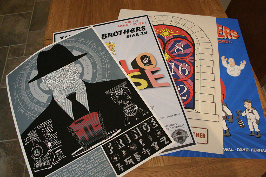 Posters PostersI have 4 UK A2 sized posters to take with me to Nerdfest. The first is some copies of the Fringe celebration poster which will be sold cheaper at Nerdfest than anywhere else online. Next is my Animaniacs Hello Nurse movie poster, available for the first time. Then there is my LOST Stained Numbers poster, available to the public for the first time. Finally the Futurama / Ghostbusters mashup poster that I announced a little while ago, again available for the first time at Nerdfest. The Animaniacs, LOST and Futurama posters will all be limited editions of 100. Animaniacs is printed on heavy weight satin and the others are all printed on the same heavy weight matte paper as the iconic series 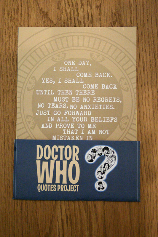 Doctor Who Quotes Doctor Who QuotesFinally as I've already mentioned there will also be my Doctor Who quotes project cards available 12 UK A5 high quality printed cards containing quotes from Doctor Who, to celebrate 50 years, that I have been creating all throughout this year. As you can see in the picture they have a custom wrapper and a few random sets will have a small bonus, but I won't tell you what that is as it will be a surprise for those that get one. Of course as you would expect from me there will also be a liberal sprinkling of t-shirts for sale including your last chance to get one of the Sherlock IOU t-shirts that was for sale on TeeBusters a little while ago. See you there ! |
| Winner ! |
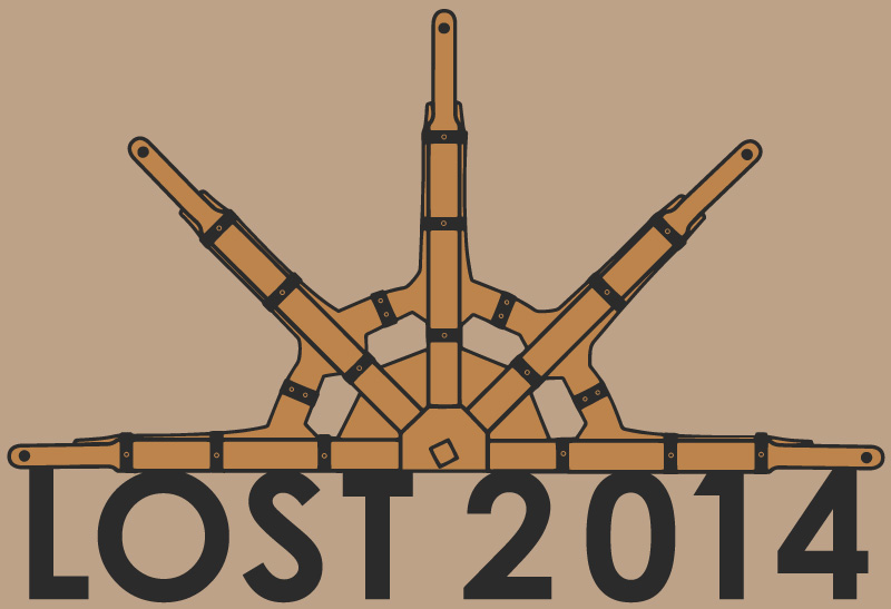
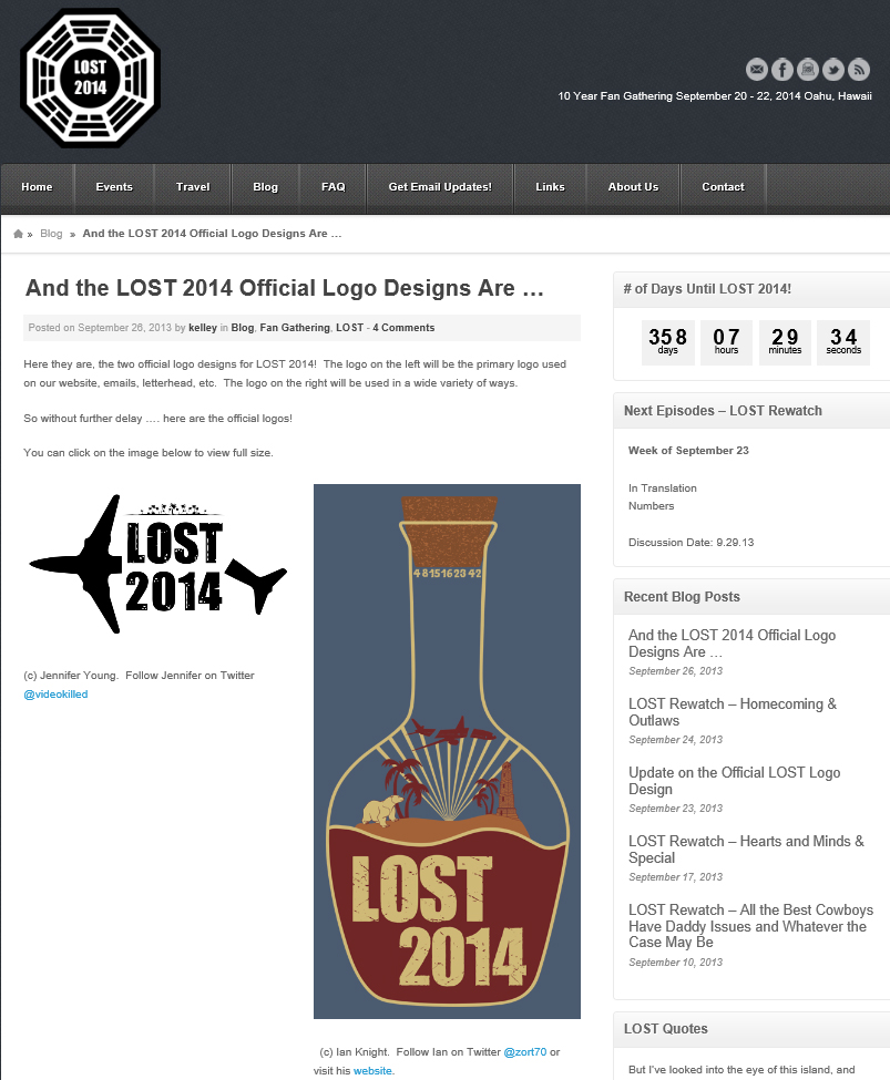 Following on from the LOST 2014 competition I am delighted to say I won ! Following on from the LOST 2014 competition I am delighted to say I won !In actual fact there are two winners as the bottle design is not 100% right for a simple one colour printed logo which I have to agree with. Exactly how my design is going to be used is unknown to me at the moment but I'm sure the people behind LOST 2014 are working overtime and will let us all know soon. Until then a special thanks to everyone that shared the details of the competition and voted for me ! |
| A Clothing Revolution |
As Cafpress announced a new NBC Revolution licence I thought it was way past time to upload some of my Revolution designs, including an all new Shut Up and Stay Here neon sign design.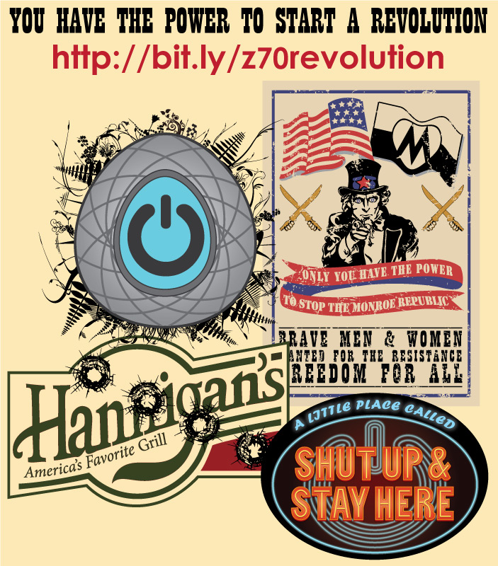 So if you want to join the Resistance against the Monroe Republic, dine out at Hannigan's or just show off your power pendant then go to my Revolution Cafepress store to see what you can get. |
| Quotes for Sale |
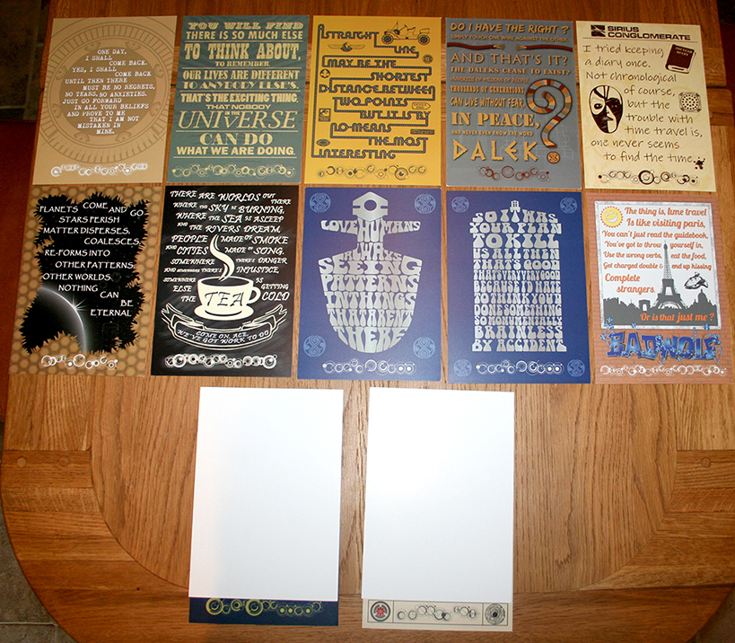 Since I started the quote project people have asked whether they will be for sale and at the start I had no illusions that people would do that ! Since I started the quote project people have asked whether they will be for sale and at the start I had no illusions that people would do that !So with me going to the Nerdfest Comic Con in Nottingham I thought that now would be the right time to see if I could find some way to let people purchase them. I looked at quite a few options and yes I could have just put them all on Cafepress or Redbubble individually, but I really wanted to keep the collection together and have some sort of control over how they were printed. After a lot of searching and weighing up options I found a company that would print them in bulk on A5 cards, the result of which you can see in the picture. You can also see a small sneak peak of the final two cards :-) The final "product" will be a set of 12 cards, 11 doctor quotes, plus the 8th Doctor Big Finish quote as a bonus, and there will only be 50 sets printed and sold. They will be available first at Nerdfest in Nottingham, and assuming they don't sell out there they will be sold online shortly afterwards. Follow me on Twitter - @Zort70 - to get the latest information on the sets. One last thing, there will be some special sets in the 50 with a little extra, but I'll let you discover that for yourselves. |
| Futurama Poster - Ghostbenders |
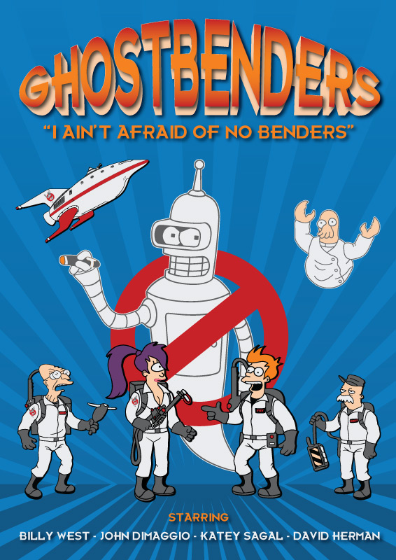 To celebrate the last episode of Futurama being broadcast (until the next time it is revived of course) I thought I'd create a poster to celebrate. To celebrate the last episode of Futurama being broadcast (until the next time it is revived of course) I thought I'd create a poster to celebrate.So my inspiration was the episode "Ghost in the Machines" and then the logical step was to mash Futurama up with Ghostbusters. I was going to keep this as an exclusive poster to be launched and sold at Nerdfest in October, but as the final episode is in only a couple of days I had to show a preview now, but it will still be a Nerdfest exclusive, and if there are any left then I will sell it online. |
| Doctor Who Quotes - Ninth Doctor |
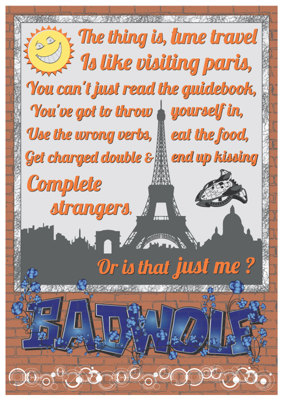 The ninth in the Doctor Who quotes project was a slightly tricky one, not because of the quote but because of how to present it. The ninth in the Doctor Who quotes project was a slightly tricky one, not because of the quote but because of how to present it.I knew I wanted to include the Bad Wolf Graffiti element so a wall was going to be the background, but I didn't want to have the quote as graffiti. So I thought why not present it as an advert, and the idea was born. Unfortunately I found out after creating this that a world famous poster artist had a similar idea for one of his projects, but sometimes worlds clash and there is nothing you can do. As to the quote itself, I love the metaphor of time travel being like visiting Paris, it shows the ninth doctor had the traditional impish sense of humour behind the rugged exterior. Oh yes, you might also see a sneaky Slitheen cruiser thrown in for good measure. See all the quotes so far by clicking here |
| S.H.I.E.L.D. Icon |
 A quick profile icon idea, just a recreation of one of the many versions of the new Marvel Agents of S.H.I.E.L.D. TV show logo. A quick profile icon idea, just a recreation of one of the many versions of the new Marvel Agents of S.H.I.E.L.D. TV show logo.Click on the image for the full sized version. 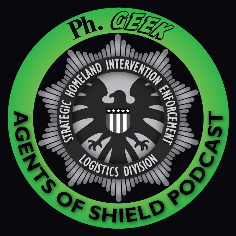 I follow the antics of the ph.Geek podcast on a regular basis and thought that this might be a suitable icon for the podcast to use, so I created it, showed it to them and they loved it. I follow the antics of the ph.Geek podcast on a regular basis and thought that this might be a suitable icon for the podcast to use, so I created it, showed it to them and they loved it.So if you get a moment, love podcasts and want to learn more about the S.H.I.E.L.D. TV show then head on over to their website and start listening today - phgeekpodcast.blogspot.com  A quick update as ph.Geek has been transformed into Phantastic Geek ! A quick update as ph.Geek has been transformed into Phantastic Geek !Same great podcast, slightly longer name :-) So of course I had to update the logo, so I gave Phantastic a little Avengers A detail and the white colour really makes the name stand out. |
| Island Protectors - 5-0 LOST Mashup |
 So after starting to design this over 2 years ago I've made some little tweaks and finally made it available as a t-shirt on Cafépress and Redbubble ! So after starting to design this over 2 years ago I've made some little tweaks and finally made it available as a t-shirt on Cafépress and Redbubble !Link to Cafepress Link to Redbubble |
| LOST 2014 Logo Competition |
|
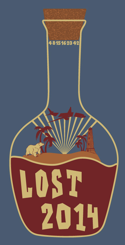
Below are my competition entries for the LOST 2014 logo competition, click on each one for larger versions and underneath each one is a vote link. More Information I had already created one of these images before the competition was announced in anticipation of this moment :-) 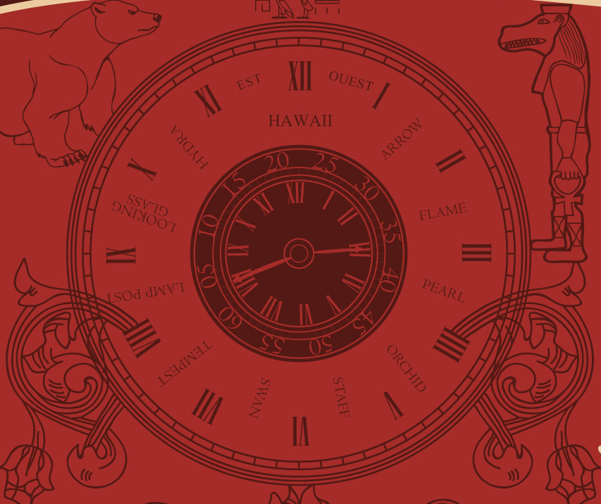 The first one I created was the McCutcheon bottle label design, however the first version had the Ajira and Oceanic airlines logos in the background of the label but as the rules of the competition don't allow them I had to swap them for a polar bear and the Taweret statue. The first one I created was the McCutcheon bottle label design, however the first version had the Ajira and Oceanic airlines logos in the background of the label but as the rules of the competition don't allow them I had to swap them for a polar bear and the Taweret statue.In the center of the label is a watch face and I have altered it from the original to include some familiar names. The second design I created was in response to the competition asking for a "logo" so I decided to strip everything back and just make it as simple as possible, the frozen donkey wheel features in a little more detail with a simple font based statement of the event name. 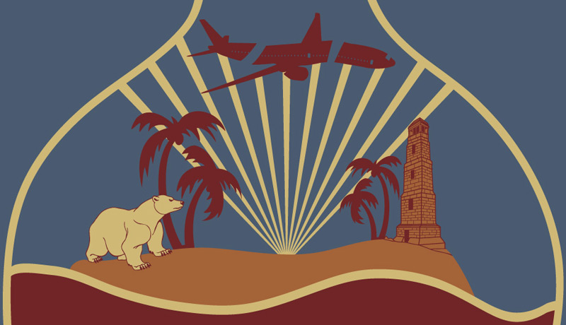 The third design evolved from an idea I had a while ago but never worked on until now. The third design evolved from an idea I had a while ago but never worked on until now.It is of course Jacob's bottle he used to describe the nature of the island to Richard (Ricardo) when he arrived. I decided to include a little diorama of the island and tried a few elements to represent the show. In the end I chose a polar bear, palm trees and the lighthouse, plus light shining out from the swan station hatch and hitting Oceanic 815. (by the way items are not to scale !) 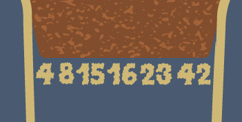 There is also a little whisp of smoke up near the cork trying to escape in the form of the numbers. There is also a little whisp of smoke up near the cork trying to escape in the form of the numbers.The fourth design was a slightly later entry, I had an idea about creating a compass based design like Locke's that Richard shows him when he is young. However looking at images of the compass prop, it isn't that remarkable and looks pretty much like any other compass. So I thought I'd come up with something slightly more original. Although the end result isn't entirely compass like it was the sentiment behind the design. I also made a decision to go for a 1 colour design (1 colour plus a background), around the outside are of course DHARMA station logos. I have had one comment to say it looks like a poker chip design, which I have to agree with, and I'd love to see if this would work at that size. Thanks for reading this rather long post and you can read all about the LOST 2014 Fan reunion by going to the website http://lost2014.com/ |
| Continuum GCC Logo + Liber8 Graffiti Icon |
 Anyone a fan of Continuum ? Anyone a fan of Continuum ?I have been liking it more and more as this SyFy TV show from Canada progresses. I was looking around the other day and couldn't find a decent version of the Global Corporate Congress logo so I thought I'd have a go at creating my own version, of course I had to add a little anarchy in the form of some Liber8 graffiti. So to celebrate the end of the 2nd season here it is in icon form for anyone to use on whatever social media site they wish. Click on the image above or click here for a larger version. |
| Doctor Who Quotes - Eighth Doctor |
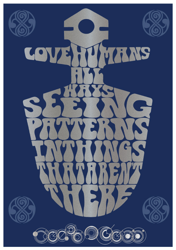 As it's August already (!) it must be time for the Eighth Doctor Who Quote Poster. As it's August already (!) it must be time for the Eighth Doctor Who Quote Poster.Paul McGann only had a few fleeting moments on screen compared to the others, but made quite an impact, I think this quote has to be my favourite from the TV movie. Being human of course I hope you recognise the pattern of the TARDIS key that the Eighth Doctor used and others used at various points in his history. 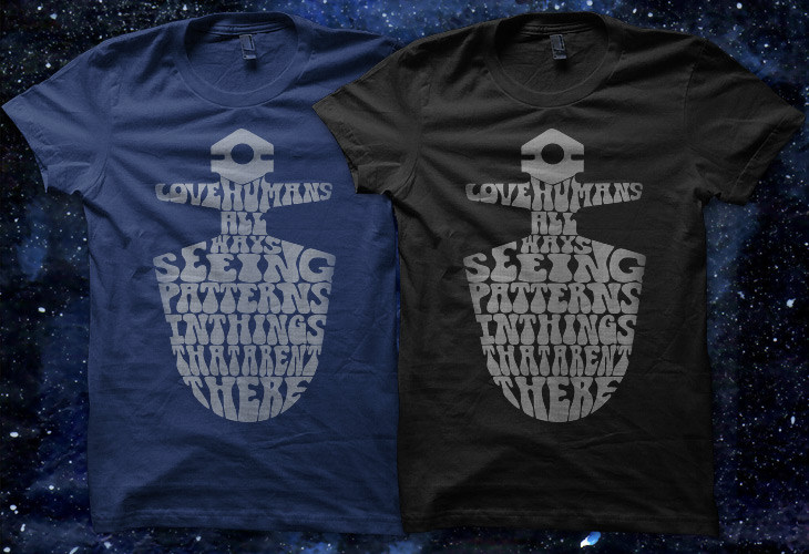 I also thought the key design would make an interesting t-shirt so I have uploaded it to a few daily print sites. I also thought the key design would make an interesting t-shirt so I have uploaded it to a few daily print sites.The first to accept it is Teebusters, if you have a moment please click here to vote for it Also available at Qwertee, click here to vote 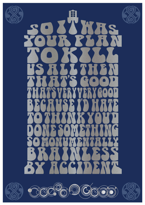 Now when choosing a quote for Doctor Eight I had a choice to make, do I stay with the on screen appearance or do I use one from the huge body of work that Paul has made with the Big Finish audios ? Now when choosing a quote for Doctor Eight I had a choice to make, do I stay with the on screen appearance or do I use one from the huge body of work that Paul has made with the Big Finish audios ?I realised that the only option was to break my rule of one quote per Doctor and recognise that huge contribution to the Doctor Who universe. So presented exclusively here is a bonus Big Finish quote from the Eighth doctor. 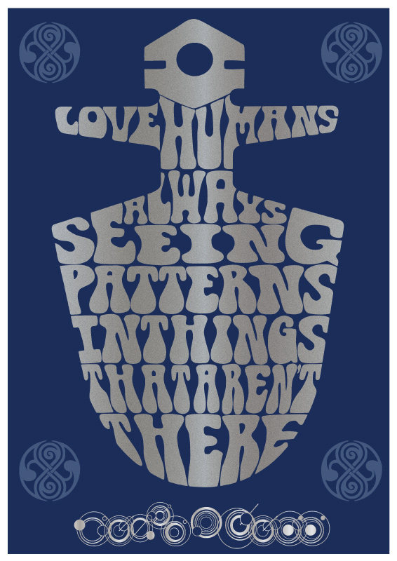 Controversy ! Controversy !The grammar police have been out in force and given me a talking to ! I was aware of the deliberate mistake in the original, however I decided to use "all ways" instead of "always" as it was neater and fitted the design in a pleasing manner. However it seems that may have been too radical for some people and I decided to try it the "correct" way and see how different it was. It may be correct but I'm still not convinced it is better, but I am going to let you all decide, let me know on which ever social media website takes your fancy and if the posters get printed I will make a final decision based on feedback received. |
| Doctor Who Quotes - Seventh Doctor |
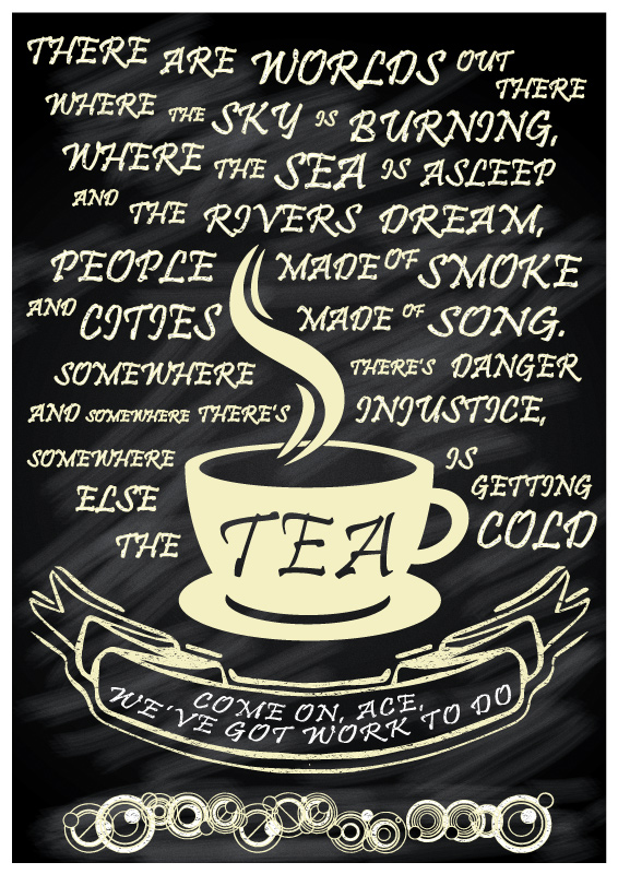 Previously only available in the fan made Celebrate Regenerate book, I now present the Seventh Doctor quote here for the first time. Previously only available in the fan made Celebrate Regenerate book, I now present the Seventh Doctor quote here for the first time.These might have been the final words the doctor ever spoke on the small screen, thankfully they were not, but they would have been quite fitting if they were In the interest of full disclosure, this was the first quote I created, last year I played around with this one and then that led to the idea of creating a quote poster for all the doctors, so the seventh was my first so to speak. |
| Opie & Thurstons Hot Sauce |
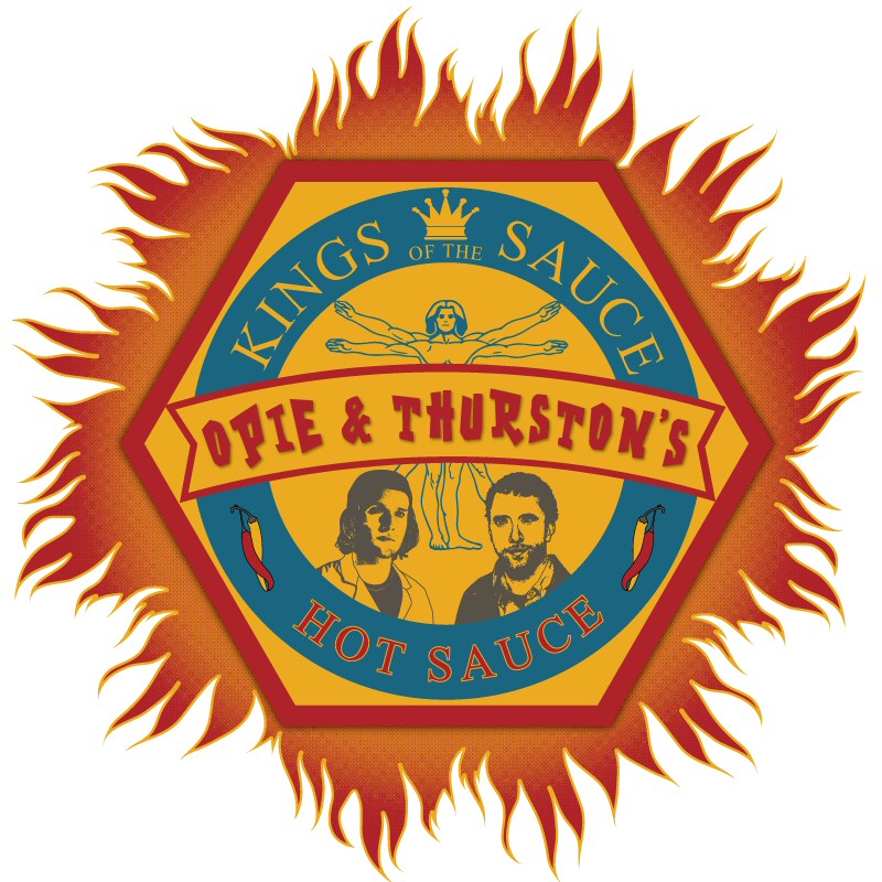 Anyone a fan of Bones ? Anyone a fan of Bones ?When I saw the episode "The Maiden in the Mushrooms" and the launch of Opie & Thurston's Hot Sauce I thought I would have a go at creating a sauce bottle label. Here is the result, based primarily on the Jeffersonian Anthropology Unit badge with some added flames ! Finally as usual I have submitted this to a few t-shirt sites so if you have a moment please go and vote for it on Qwertee |
| Big Bang Theory Professor Proton |
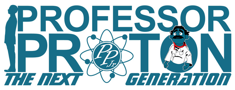  I'm a big fan of The Big Bang Theory and when I saw Professor Proton in an episode that aired in the UK a few days ago I knew I wanted to create this. I'm a big fan of The Big Bang Theory and when I saw Professor Proton in an episode that aired in the UK a few days ago I knew I wanted to create this.The first one created to the right is the original Professor Proton logo with the theme song. The second, above, is my version of what the Professor Proton Junior logo might look like when Sheldon has been handed the reigns by the original Professor. Of course it had to have the words Next Generation in it and I also thought I'd have a go at including Gino. I have added these designs to my stores if you want to purchase t-shirts, mugs, stickers and more with the designs on, so make your choice if you have a preference - Click here for Cafepress Click here for Redbubble |
| Excellent Me |
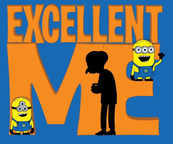 After watching Despicable Me 2 at the cinema the other night I wondered why there were no three eyed Minions Then it hit me, they weren't working for Mr Burns at the springfield Nuclear Power Plant ! So taking my inspiration from Blinky the three eyed fish that was found at the lake near the nuclear power plant I created a couple of three eyed minions and made the sinister Mr Burns their master, altogether now....Exceeeeelleeeent. 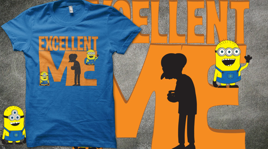 I've added the t-shirt to TeeBusters if you have a spare moment please head on over and vote. I've added the t-shirt to TeeBusters if you have a spare moment please head on over and vote. |
| Celebrate Regenerate |
 This is Celebrate Regenerate, a fan made, not for profit book celebrating all 50 years of Doctor Who. This is Celebrate Regenerate, a fan made, not for profit book celebrating all 50 years of Doctor Who.Articles about all the stories, interviews with the past and present of DW and lots of great art. The book features all the current DW quote posters and also the debut of the 7th doctor Quote poster. So go have a look, it is free to download or you can have a printed version created with £1 for each one sold going to Children in Need. More information and the download / purchase links can be found at - CelebrateRegenerate.weebly.com |
| Defiance Lawkeeper Idea |
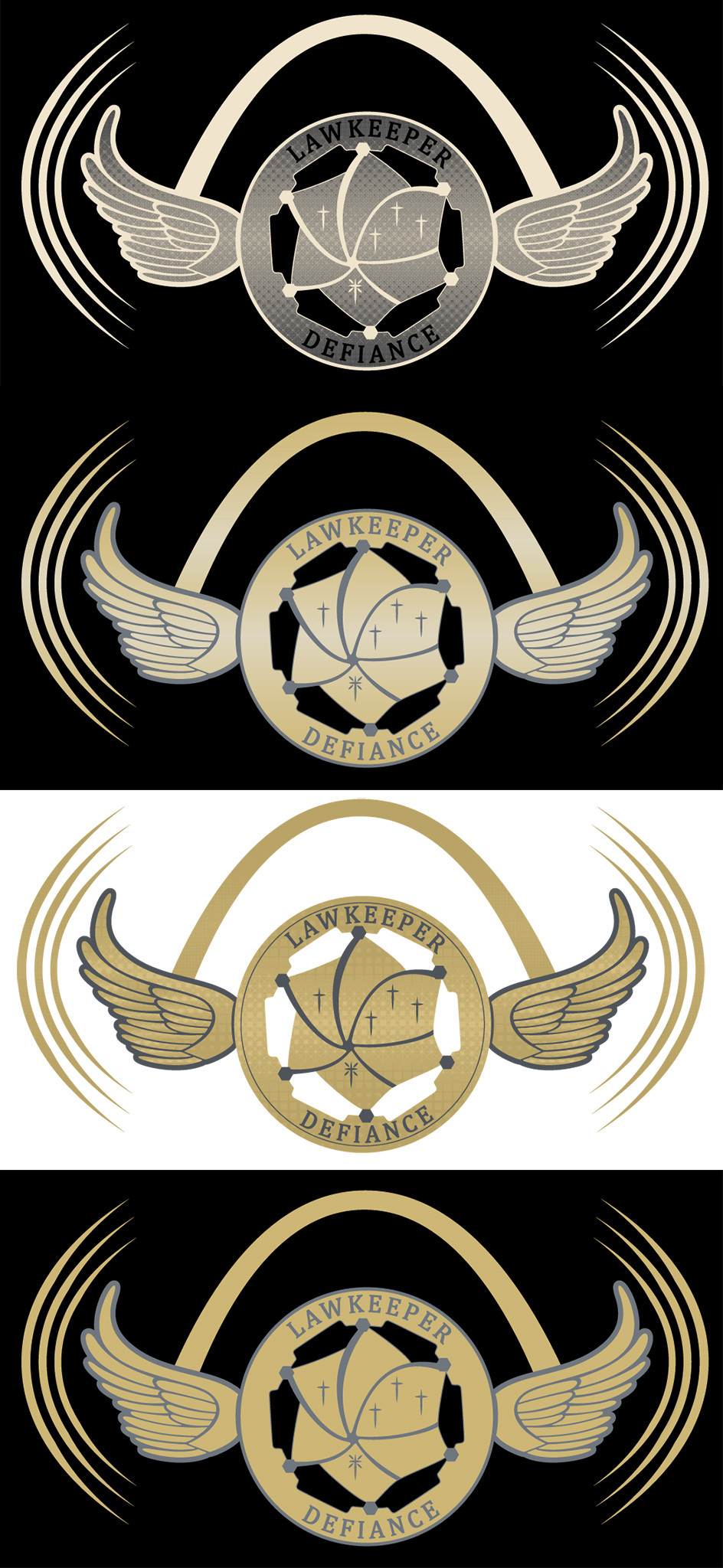 This is a little idea for a potential t-shirt design for the SyFy show Defiance. This is a little idea for a potential t-shirt design for the SyFy show Defiance.I posted an initial version of the badge a little while ago, but wasn't entirely happy with it, so I went back and rebuilt the badge, and included the cross / star symbols seen in later episodes. I then thought if this was going to be a larger t-shirt design then I needed to add the arch and decided to add some wings to tie the badge and arch together. The arcs at the side were just to give a little more interest and width to balance the height of the arch. Although not everyone is sure about them. The different colour versions are really just to experiment and I think the second one is my favourite so far. If you have any feedback for me on what you think it would be appreciated. |
| IOU Sale on TeeBusters |
|
Thanks to everyone who sent comments, shared the details and even bought one No idea what the sales numbers are yet but I hope a few people bought some ! 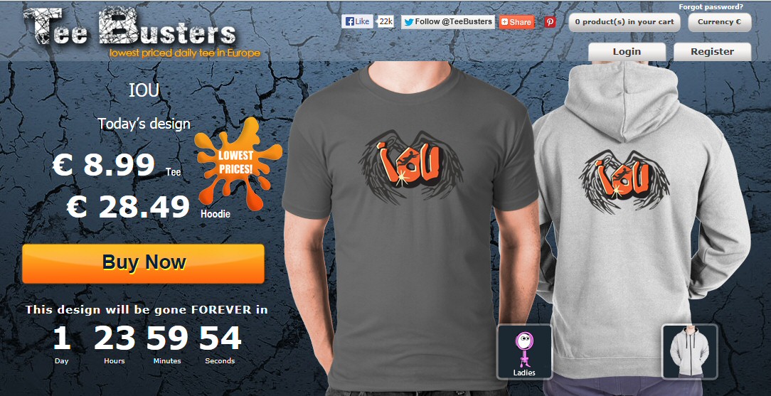
|
| Time for an IOU to be Paid |
 Thanks to everyone that voted, this BBC Sherlock inspired t-shirt design will be up for sale on TeeBusters.Com very soon. Click on this link to see more details and get an exclusive free Sherlock wallpaper. |
| Bad Wolf Day |
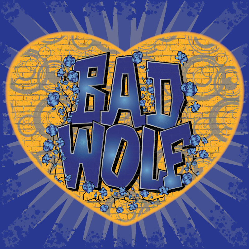 Love the Bad Wolf ? Then why not show it. Love the Bad Wolf ? Then why not show it.I read about the fans attempt to get Bad Wolf in as many places as possible on one day and thought I'd have a go at creating some Bad Wolf related graffiti art that might help spread the word. I found the information on this Facebook group page and it has some more details there The second image below was the first one I created as a simple wall style graffiti piece with Roses (what else) surrounding the words Then I thought why not show some love for the Bad Wolf and added a heart around the design to give it a more focused look. 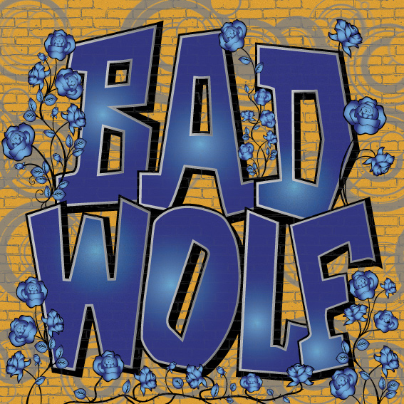 Click on either of the two images to show the larger size and feel free to use them on your preferred social media or other website, or simply print a copy off and pin it up at home / work / the nearest random place ! Click on either of the two images to show the larger size and feel free to use them on your preferred social media or other website, or simply print a copy off and pin it up at home / work / the nearest random place !I have also uploaded the heart design to Redbubble and Cafepress Click here to purchase Hoddies, t-shirts or stickers on Redbubble Click here to purchase t-shirts, baseball jerseys and more on Cafepress 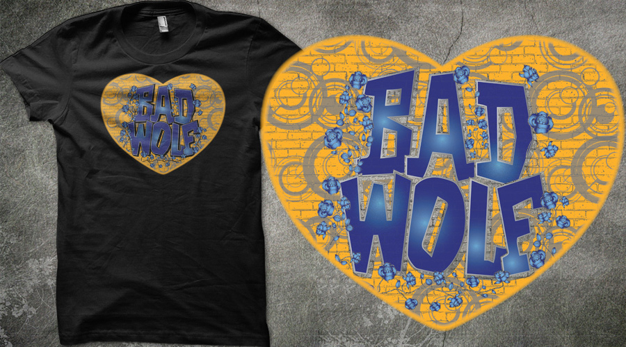
|




 Why Zort ?